ChatGPT App Store Screenshots: A Conversion Analysis
Analyze how ChatGPT uses benefit-led App Store screenshots to communicate image creation, visual learning, planning, and everyday AI value.
In this article
- 01ChatGPT sells outcomes, not model terminology
- 02The first three screenshots at a glance
- 03Screenshot one turns capability into imagination
- 04Screenshot two personalizes the learning promise
- 05Screenshot three broadens the product into planning
- 06The visual system keeps attention on the result
- 07The copy is benefit-led without becoming vague
- 08Search intent and screenshot intent are aligned selectively
- 09What the first three frames do not address
- 10Review language suggests additional creative directions
- 11Alternative sequences worth testing
- 12Lessons for smaller AI apps
- 13A practical screenshot test plan
- 14FAQ
ChatGPT sells outcomes, not model terminology
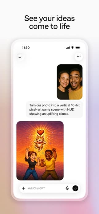
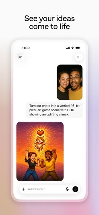
The first three ChatGPT App Store screenshots do not lead with model names, benchmark claims, or a dense feature list. They show three recognizable outcomes: creating an image from a personal photo, learning a concept visually, and preparing for a demanding goal.
That makes the screenshot sequence consistent with the subtitle Your everyday AI assistant. Instead of explaining the technology, the creative demonstrates where an assistant can fit into everyday life. This analysis uses the public United States App Store listing captured on June 27, 2026.
The first three screenshots at a glance
| Frame | Headline | Workflow shown | Conversion job |
|---|---|---|---|
| 01 | See your ideas come to life | Turn a personal photo into a stylized image | Create an immediate emotional payoff |
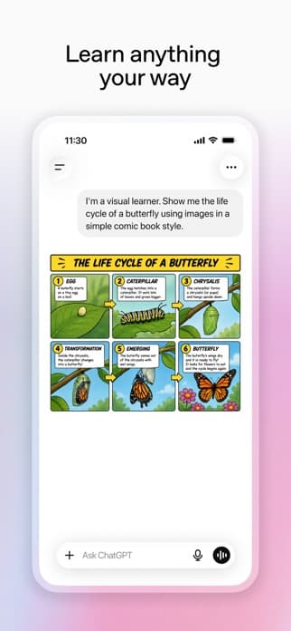
| 02 | Learn anything your way | Explain a butterfly life cycle as a visual comic | Show personalized, multimodal learning |
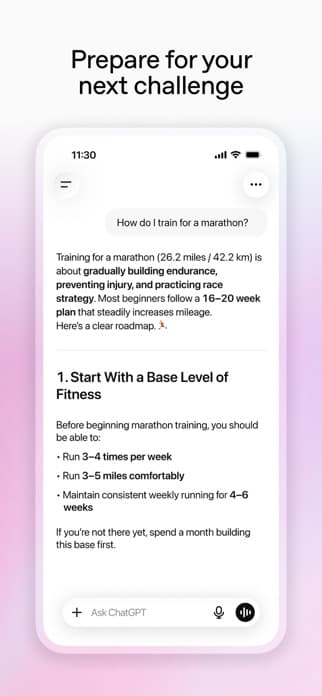
| 03 | Prepare for your next challenge | Build a structured marathon training plan | Demonstrate useful planning and guidance |
Screenshot one turns capability into imagination
See your ideas come to life is broad emotional copy, but the image below makes it specific. A user photo, a natural-language prompt, and a finished stylized result appear in one frame. The screenshot communicates input, interaction, and output without a technical explanation of image generation.
This is a strong first frame because the transformation is visible. The user does not have to imagine what AI image toolsmeans. The finished image provides proof and the personal photo makes the workflow feel accessible rather than professional-only.
The tradeoff is category focus. Opening with image creation may cause some visitors to read ChatGPT as a creative image app before they see its broader assistant role. Brand familiarity reduces that risk, but a lesser-known assistant would need a clearer category cue.
Screenshot two personalizes the learning promise
Learn anything your way makes personalization the benefit. The prompt asks for a visual explanation in a simple comic style, and the response demonstrates the requested format. This is more persuasive than a generic headline such as AI-Powered Education because the user can see how the app adapts the explanation.
The frame also expands the product from creation into understanding. That transition is important: the first screenshot proves ChatGPT can make something, while the second proves it can reshape information around a user's learning preference.
Screenshot three broadens the product into planning
Prepare for your next challenge introduces a different kind of value. The visible marathon question and structured plan show ChatGPT turning an open-ended goal into steps. The frame is less visually dramatic than image generation, but it communicates a repeatable everyday workflow.
Together, the three frames create a progression from inspiration to learning to action. That sequence supports a general assistant position more effectively than three screenshots of the same chat interface or three isolated feature labels.
The visual system keeps attention on the result
- Large black headlines create immediate hierarchy
- A consistent phone frame teaches the interaction pattern
- Soft color fields separate creative without adding clutter
- Prompts stay visible enough to explain how the result was produced
- Outputs occupy the most valuable part of each device screen
The creative uses the UI as evidence rather than decoration. Each frame shows a believable request and response, which makes the headline easier to trust.
The copy is benefit-led without becoming vague
The headlines use broad verbs—see, learn, prepare—but the product visuals supply specificity. This is a useful copywriting pattern: emotional or outcome-led language can work when the image immediately answers how?
What the words do
- Make the outcome feel relevant
- Avoid technical model language
- Keep each frame easy to scan
What the images do
- Show the input and output
- Prove multimodal capability
- Make broad claims concrete
See more before-and-after formulas in the App Store screenshot copywriting guide.
Search intent and screenshot intent are aligned selectively
The first three frames support several valuable keyword clusters: AI image creation, visual learning, AI tutoring, personal planning, and general AI assistance. They do not attempt to cover every public use case in the description.
That prioritization is good conversion discipline. A screenshot carousel should not become a visual keyword field. However, different traffic sources may need different opening sequences. A user arriving from an AI writing, coding, voice, or research query may respond more strongly to a task-specific Custom Product Page.
Use the AI assistant keyword map to connect each acquisition cluster with an appropriate screenshot promise.
What the first three frames do not address
No opening sequence can cover everything. The first three current frames leave several conversion questions for later creative, the description, reviews, or the product itself.
- How voice conversation changes the mobile experience
- How ChatGPT supports professional writing and research
- What users receive with paid plans
- How current information and sources are handled
- What privacy and connected-data expectations apply
These are not necessarily failures. The correct question is whether the default first three frames cover the highest-value broad audience and whether alternate product pages cover narrower acquisition intent.
Review language suggests additional creative directions
Visible positive reviews discuss study help, step-by-step explanations, quick answers, creative work, planning, and emotional support. Visible critical reviews mention slower responses, crashes, changing behavior, reliability, and value. These examples are directional rather than a complete review sample.
A quantified review analysis could test screenshot directions such as Break Down Difficult Concepts, Go From Question to Clear Next Steps, or a reliability-focused message if the product evidence supports it. Review-derived copy should use repeated themes, not one memorable comment.
The upgraded reviews-to-conversion framework explains how to move from raw review clusters to testable creative.
Alternative sequences worth testing
Default broad-assistant sequence
- Bring Any Idea to Life
- Learn in the Format That Works for You
- Turn Big Goals Into Clear Next Steps
Work and research product page
- Turn Rough Thinking Into Clear Work
- Ask Questions Across Your Documents
- Move From Research to a Useful Draft
Study product page
- Understand Difficult Ideas Your Way
- Turn Notes Into Visual Explanations
- Practice With Questions Built for You
These are hypotheses, not claims about which sequence will win. Conversion testing should determine whether the added specificity improves results for each traffic source.
Lessons for smaller AI apps
- Demonstrate an outcome instead of naming an AI capability
- Show enough of the prompt to make the result believable
- Use the first three frames to expand one position coherently
- Let strong outputs carry visual proof
- Build alternate sequences for distinct acquisition intent
- Avoid copying ChatGPT's breadth without comparable product depth
For the broader competitive context, read the ChatGPT vs Claude vs Gemini ASO comparison.
A practical screenshot test plan
- Define the traffic segment and the job it expects
- Record the current product-page conversion baseline
- Change one message sequence, not every visual variable
- Use an output the product can reproduce reliably
- Run the test through a meaningful traffic cycle
- Compare conversion quality as well as raw install lift
Continue with the App Store conversion rate guide to evaluate the full listing rather than screenshots in isolation.
FAQ
What is the main strength of ChatGPT's screenshots?
The first three frames make broad everyday benefits concrete with visible prompts and outputs. They communicate creation, personalized learning, and planning without relying on technical terminology.
Why does ChatGPT lead with image generation?
The visual transformation produces immediate proof and emotional impact. It also shows a multimodal workflow in a single frame.
Should smaller AI apps copy this sequence?
They should copy the outcome-led structure, not the exact use cases. A smaller product should lead with the specialist job it performs best.
How often should screenshot analysis be updated?
Recheck the public listing monthly and update the article whenever the first three frames, subtitle, major product promise, or pricing model changes.
Continue your ASO workflow